Gone are my dreams of having a large vaulted subterranean dipsomaniac's dream cellar. When I last blogged about are hopes for a
cellar in 2009 we had planned to have a large basement level underneath the manor house. However, due to sticking to the b*dget (It should be a rude word), we had to drastically minimse the basement level. Now I can do without a home theatre, I can do without a bowling alley (not that we ever wanted one of those) But, I will not do without a wine cellar.
I am not a connoisseur, and although my knowledge of NZ wines is very good, I am a novice when it comes to Bordeaux or Super-Tuscans. But I am a collector by nature and I am a traveler. I have designed places in the manor house to display all our collections, and I don't see why wine should be any different.
Also, it is my plan one day to take an extended tour of the chateaux and vineyards of the Loire valley. And when I do, it would be nice to bring some mementos home with us.
So, having settled on the plan there is only one place a wine cellar can now go, adjacent to and under the stairs. Luckily it is a 12 foot stud, and there is a little space between the stairs and lift. So, I stayed up last night re-researching cellar ideas for homes. I then use photoshop to design the cabinetry for the four walls using component ideas I had found. I then downloaded sketchup, learnt how to use it and had a little play. These are the results!
Firstly: narrow is OK. It does not need to be a spacious cavern...
Secondly: Why become down and out when you can go up:
Niches are very popular...
as are cabinets under the niches, such as this one being used as a cigar humidor...
Wine racks can be free standing...
or built in...
Bottles don't have to be perpendicular to the wall. If a narrow area is all you have, try a little lateral thinking...
Sliding trays are stylish (but do take up room)...
and a presentation level at mid torso height is a great way to display your finest vintages...
You can think outside the box and go for diamonds....
But remember, it is hip to be square. When you need a little storage space for something that isn't a bottle you may regret going for diamonds...
When we finally take that Loire tour, I am going to bring home plenty of wooden boxes...
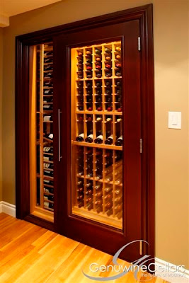
Seeing the bottles is important. A cellar is about display as well as organisation and storage. Otherwise people would keep them in a cardboard box somewhere. Glass doors and windows add that finishing touch to your collection....
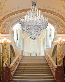
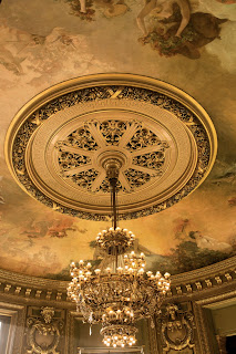
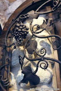
Trying to still evoke that memory of a medieval chateaux, wrought iron sconces and chandeliers help a lot (coupled with masonry and rough hewn stone floors)...
I have found a chandelier that I love...
and a back up...
Matched with wall sconces...
and One can really go to town with the ironwork when it comes to doors...
again, they are a mixture og glass and iron so that One can see in.
It adds intrigue, esp if the doors are locked!
I did briefly contemplate a spiral staircase cellar under the kitchen, but with regard to engineering costs we would be right back to where we started.
Goodbye underground treasure cave...
I got a lot of inspiration for the component design with the help of a most amazing cellar design website http://kessickwinecellars.com/. They have some amazing ideas to play around with.


.jpe)


