Pages

Saturday, May 31, 2014

Billiard Table...


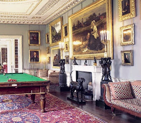
Peter has done really well over the last month, finding not only the grand piano, but also a billiard table. It is identical to the one below:

Peter bought it from a pool enthusiast who had not long since finished lovingly restoring it. But now with a young family, he has found that he no longer has time to play, and was looking for a good home for it. I can't think of a better home than WBP. Now we just need to set about sourcing materials to decorate the room

We have already chosen the lighting, which is being hand manufactured in the UK by craftsman David John:
Above: Billiard lights with green glass shades in French gold finish
Below: Picture lights in French gold finish.

and we have our hunting trip booked to bring back a stag's head (and some venison for the freezer).

Here are some other billiard room design ideas...
Above Images from Pinterest and Tumblr

On one side of the hearth we have a door leading to the gold drawing room, on the other side of the hearth we will mirror with fearless symmetry the architrave of that doorway, but instead of there being a door, the architrave will frame a cue holder, topped with a score keeper, similar to these ideas...


Thursday, May 29, 2014

Capital Idea!


We have just seen the first prototype for the Scamozzi capitals for the manor. It has been carved by Konstantinos, our master carver for the project. We gave him some old prints and asked him to create a capital in keeping with the neoclassical design for the manor and this what what he came up with. We love it. Now it has been approved they will start working on the stone capitals.

Below: Some of the pictures we gave Konstantinos.

Throughout the project we have a range of various columns. There are free-standing columns, engaged columns (where at least 1/3rd of the column is embedded into a wall), and pilasters (planted columns on a wall, resembling engaged columns but square). There are four different sizes of each of these columns, and each has a separately carved capital and base to ensure that components remain in scale (something very important to a Neoclassical eye).

Above and Below: The creation of a wooden prototype, to scale, prior to creating stone columns.

We took a long time ensuring that not only was there an entasis to the column, but that the entasis was also in proportion with the overall aesthetic of the manor (as there are multiple formulae for working out entasis based on a column's height, which will produce bulkier vs more elongated columns). These examples of entasis below demonstrate the curves well, but as you can see, produce a column that is too stocky...


Entasis is a classic trick of creating a subtle convex bulge throughout the length of the column (so it is nor the same girth all the way up, not does it simply taper). This actually makes a column more pleasing to the eye. Hero of Alexandria, the ancient mathematician and engineer (10-70AD) explains that entasis corrects the optical illusion of concavity in the columns which the human eye would make if the correction was not made.