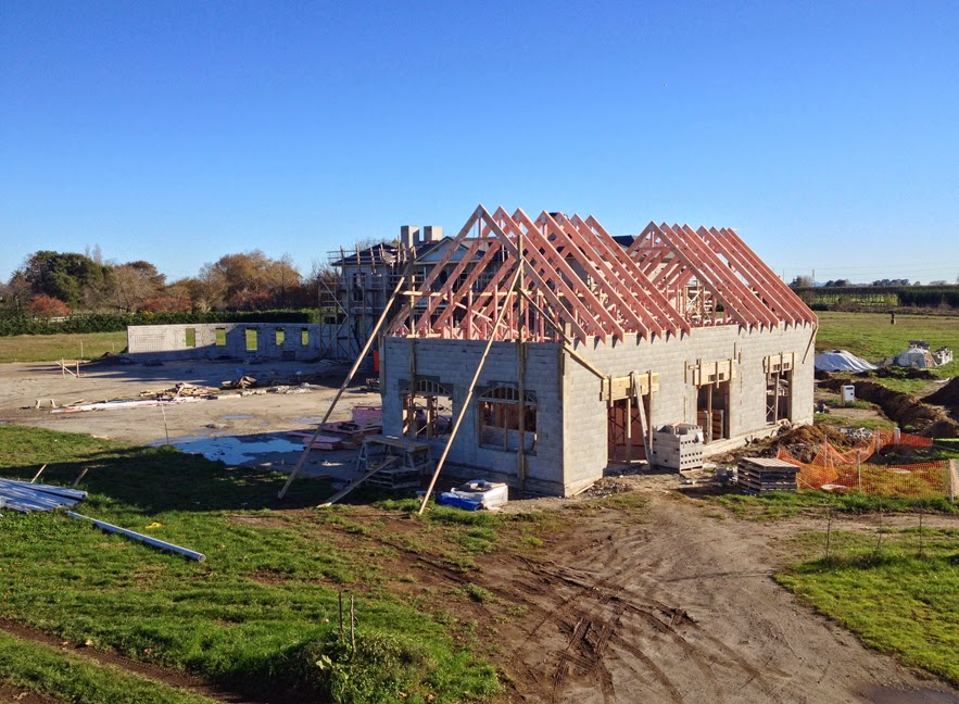
There was another moment of excitement this week as I received pictures of the carriage house starting to take shape. It is fun to see things which one has designed oneself on paper start to take on three dimensions...
The carriage house site has gone from this 10 weeks ago...
to this 8 weeks ago...
to this 4 weeks ago...
to this 2 weeks ago...
to this, this week...
Above photos are taken from the balcony above the front door.
Below is a photo taken from the East towards the lake.
Below: The beautiful golden hour of twilight catching the top of the gables. This view was taken from one of the Blenheim Suite windows.
Below: The view from the roof of the old barn. This view has until now shown the front of the manor, which is now almost fully obscured by the rising carriage house.
Above: The front elevation as planned.
Below: The front facade taking shape...
Facade on 16 June 2014:
I drew inspiration for the design of the front of the carriage house from
stables and other carriage houses. The arch in the centre has actually been changed to a higher semi-circle so that it resembles one of these arches below...
Above is a set of plans for the ground floor. The space on the right was originally going to be our country store, but now that we will only be having an online store we can use it for something else. I think it would be a great little area to set up a micro-brewery. We have already planted cider apples for WBP cider, planted Juniper trees and bought a still to make WBP gin, and have planted a vineyard to make WBP wine! Besides, my friend Richard (who is setting up a small estate outside Christchurch) and I are going to be having a few fierce competitions in the kitchen and in the brewery, so I had better take it seriously. But I digress.
We knew we wanted automated garage doors, but we wanted to keep the traditional look of solid stable doors, complete with ornate iron hinges, so we found a company that was able to make automated sectional roller doors, which still resembled the doors we loved. Below is an example of their work. Ours will essentially be the same, although they will be made from stained cedar instead of painted pine...
Here are some other handsome doors which gave us inspiration...
The loft of the Carriage House is a lovely open plan area. We wanted the loft decor to be in contrast with the refined and formal interior of the Manor. We wanted to catch something of a rustic country cottage or barn. Below is a plan showing the large Stable's Suite which is a self contained apartment. It has a large bedroom at one end, connected to an open plan lounge/dining area, and kitchen.
Some inspirational interiors showing light, open interiors with exposed beams, such as the Stables Suite will have...
I actually used this photo above when I designed the symmetrical doors into the suite, the one on the left being a wardrobe and the one on the right leading to the kitchen / dining room...
The lounge
I love matchstick ceiling boards...
shown here with amazing exposed beams...
Other lounge photos. The ceilings are not as remarkable but the decor is quite country..
The Bedroom
The Kitchen
OK, maybe you can have too much rustic...
There is not enough room for a large island in the kitchen, like in the manor, but we will to ask our carpenter to make a nice little matching butcher's block instead. This sweet little one would work...
We are finally starting to track a little over budget and a little over time, but not much. I guess it is expected on a large project. We are now expecting to be up and running in January, but are hoping to still shift in by the end of the year. I look forward to sharing more photos when we hit week 50 of the build (2/3rds of the way through).


No comments:
Post a Comment