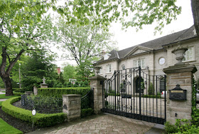
This week we finally broke ground on the first building project at Willowbrook - The Entrance. We had spent a lot of time researching and designing the wrought iron gates and the entrance walls. We started looking at a few entrance concepts a couple of years ago (previous post on gate ideas).
We wanted the gates to be suitable impressive and elegant without being over the top. The over the top option was excluded by council bylaws anyway, which state that gates may not be more than 2 metres high. So, we made sure the highest point of the gate was at 2m, and then worked backwards...
The scrolling top for the gate was based on a gate in London that I had taken a photo of, near Kew Gardens:
Above: The idea for the scalloped sections.
Then we had to decide about styles of pillar...
Above: These were my favourite pillars, with the curved mouldings at the top which will match the curved moulding on the front of the manor house architrave.
Urns and finials seem to be popular for atop the pillars, but we had already sourced some stone lions from Gloucestershire for the job...
Other Pillars and toppers...
Then we had to decide upon which way the walls would curve.
Inwards...
Inwards...
or outwards...
or not at all...
We went for the first choice, as curving inwards allows us to have more space for gardens, and also for vehicles to pull in off the road.
Below is my plan for the gardens around the entrance - formal with a variety of shades of green, and differing heights. The Leilandii hedge running along the front of the property with tuck in behind the front wall and grow about 2 feet taller than the wall. This will add security, and continuity with the rest of the front hedge, and will allow the perpendicular hornbeam hedges to be grown to the same same height without being seen end-on from the road.
For scale, the driveway is 5 metres wide, with the plane trees being shown at their current size. Their canopies will eventually drape over the outermost third of the driveway, creating a dramatic avenue visible from the road. The Willows will be planted just outside of the hornbeam hedges, so that their trunks will not be visible from the pedestrian gates, and they will cascade over the front wall on either side, flanking the entrance.
An example of a 2 tiered retaining wall with a garden sandwiched in the middle...
Next: where to put the pedestrian gates?
.jpg)
It seems traditional to have them on the main frontage, on either side of the vehicular gate. We, however, have decided to sit them at 90 degrees to the main gate, just inside the front wall. This will allow us to place an ornamental focal point against the hornbeam hedging, in the direct line of sight from the pedestrian gates for added interest, and means that the pedestrian gate is next to the post box.


We had already found the lights that we liked, which are similar to these below...
We feel that the lights had to be large enough to really stand out, esp as the whole gate and wall had been scaled back to meet local regulations. Little lamps, although sweet, would not cut it...
Then decisions about letter box placement. We decided to incorporate it into the pillar of the wall closest to the road, so that the postman could easily access it from the car window. Having rural delivery means that if you have a flag attached to the box, you can both receive and send mail from your box - very convenient in the country. Our Architect designed a fold away brass lever system to pop the flag in and out of a slot in the pillar.
and finally, to gild or not to gild?
Solid gold would look far too ostentatious and attract the wrong sort of attention, but a subtle gold crest painted on a black background would be stylish without being gaudy. Hence keeping the circle in the scrolling top of the gate just like at Kew...
I look forward to sharing mores pictures with you as it progresses.


.JPG)


I like your choice of gate. Having the wall curving inwards is much better than curving outwards.
ReplyDeleteI think it will look very regal and provide a fitting entrance to your estate!