Wednesday, July 31, 2013
Chatsworth Bathroom...
The Chatsworth bathroom is designed with a pinkish-red marble in mind. It is 'allowed' to be a little darker than the other bathrooms as the Chatsworth suite is a sumptuous and rich mixture of baroque mahogany furniture and red damask fabrics.
But it has been so hard to find examples of a red marble bathrooms, which makes me wonder whether we should be re-considering whether it is a good colour?
The colour we're looking for is similar to that of this amazing roman styled red marble bath:
There are a variety of various colours and textures...
One looks too much like a piece of steak
(Hugh Fearnley-Whittingstall would love a piece of steak with good fatty marbling to it)
I know that darker colours make a space look smaller, but with the other bathrooms being white or beige I wanted something really different for the Chatsworth, and fitting of the bedroom decor.
This light coloured marble with a red seem running through it is quite nice...
but this orange marble is not...
Some look more brown than red...
Guess I'll stay on the look out. The marble samples from Greece should arrive next week. There will be plenty to look at and choose from, from several quarries. Once we have chosen the marble from the swatches we then get to choose the exact pieces we would like from each quarry before they are laser cut and shipped over.
Below: Nero's bath - red marble. Hewn by hand. Imagine what the Romans would have achieved with today's cutting edge technology.
Saturday, July 27, 2013
Swinging from the Chandeliers...
We have bought our first chandelier! It is the largest of the chandeliers we plan to have at WBP and will hang in the foyer. It is 6 feet wide and 6 feet tall. It is a Maria Therese chandelier, made from Austrian crystal and gold plate, and has 64 lights (Happy Birthday Peter)!
Below: Actual Photo
We have also been researching the other sparkly things for around the manor house. We have found some possibilities...
Lighting in the lift:
for the chandeliers in the ballroom and music room:
paired with these wall scones...
In the informal entertainment area we shall have 3 of these chandeliers (same as ballroom, but a size smaller)...
with 3 of these sweet little modern chandeliers for above the bar:
For one of the drawing rooms...
paired with sconces
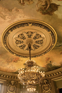
Then we might have two of these gold empire-styled chandeliers for the dining room:
or these
with 2 candelabras for the side board:
Billiard Room:
Powder Room sconces for either side of the mirrors:
We have chosen traditional Georgian hanging lanterns for the hallways (which we will have gilded):
Dressing Room:
Above Kitchen Island:
We are still on the look out, as apart from the first one, which is winging its way to NZ, we are not 100% sure about these choices. As always, it is a compromise between budget and desire. And one huge problem is that we can not buy anything from the USA, as it does not meet NZ's code of building compliance or safety standards (which is a real shame, as there is a lot of really neat lighting we have found on US websites). If anyone knows of any good British or European websites, do please let us know.
In the meantime, here are some more inspirational sparklers...

Labels:
Chandelier,
Elevator,
Lift,
Lighting,
Marble Foyer
Friday, July 26, 2013
The Wine Cellar Revised...

Gone are my dreams of having a large vaulted subterranean dipsomaniac's dream cellar. When I last blogged about are hopes for a cellar in 2009 we had planned to have a large basement level underneath the manor house. However, due to sticking to the b*dget (It should be a rude word), we had to drastically minimse the basement level. Now I can do without a home theatre, I can do without a bowling alley (not that we ever wanted one of those) But, I will not do without a wine cellar.
I am not a connoisseur, and although my knowledge of NZ wines is very good, I am a novice when it comes to Bordeaux or Super-Tuscans. But I am a collector by nature and I am a traveler. I have designed places in the manor house to display all our collections, and I don't see why wine should be any different.
Also, it is my plan one day to take an extended tour of the chateaux and vineyards of the Loire valley. And when I do, it would be nice to bring some mementos home with us.
So, having settled on the plan there is only one place a wine cellar can now go, adjacent to and under the stairs. Luckily it is a 12 foot stud, and there is a little space between the stairs and lift. So, I stayed up last night re-researching cellar ideas for homes. I then use photoshop to design the cabinetry for the four walls using component ideas I had found. I then downloaded sketchup, learnt how to use it and had a little play. These are the results!
Firstly: narrow is OK. It does not need to be a spacious cavern...
Secondly: Why become down and out when you can go up:

Niches are very popular...
as are cabinets under the niches, such as this one being used as a cigar humidor...
Wine racks can be free standing...
or built in...
Bottles don't have to be perpendicular to the wall. If a narrow area is all you have, try a little lateral thinking...
Sliding trays are stylish (but do take up room)...
and a presentation level at mid torso height is a great way to display your finest vintages...
You can think outside the box and go for diamonds....
But remember, it is hip to be square. When you need a little storage space for something that isn't a bottle you may regret going for diamonds...
When we finally take that Loire tour, I am going to bring home plenty of wooden boxes...
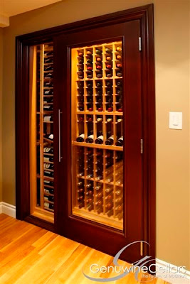
Seeing the bottles is important. A cellar is about display as well as organisation and storage. Otherwise people would keep them in a cardboard box somewhere. Glass doors and windows add that finishing touch to your collection....

Trying to still evoke that memory of a medieval chateaux, wrought iron sconces and chandeliers help a lot (coupled with masonry and rough hewn stone floors)...
I have found a chandelier that I love...
and a back up...
Matched with wall sconces...
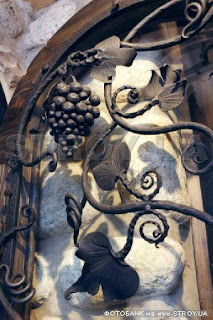
and One can really go to town with the ironwork when it comes to doors...
again, they are a mixture og glass and iron so that One can see in.
It adds intrigue, esp if the doors are locked!


I did briefly contemplate a spiral staircase cellar under the kitchen, but with regard to engineering costs we would be right back to where we started.
Goodbye underground treasure cave...

I got a lot of inspiration for the component design with the help of a most amazing cellar design website http://kessickwinecellars.com/. They have some amazing ideas to play around with.
Labels:
Vineyard,
Wine,
Wine barrels,
wine cellar
Subscribe to:
Comments (Atom)


.jpe)


