Saturday, February 28, 2015
Hooray and Up She Rises...
I was very happy to be home last week to see several small milestones met on the building project. The first small but satisfying moment was seeing the erection of the clock tower and weather vane on top of the carriage house.
It arrived at the end of last year and had been wrapped up on a pellet inside the foyer...
There was talk about getting a crane in to set it atop the roof, but when the digger was on site to start on the courtyard contouring the builders decided they would use a combination of the digger and the construction of a roof ladder to shift the components up there themselves, which proved an ingenious idea...
Above: The digger lifting the carcass of the tower up to the builders.
Below: The tower sitting on the lowest rung of the roof ladder.
Once the tower was up on the base and secured they did the same with the lead pagoda-styled roof...
And then assembled the weather vane, checking the compass points were accurate (the weather vane is set to true north whereas the manor is built on magnetic north)...
A sense of accomplishment...
Now it just needs to have its electrics wired and then it will be fully functional!
We are now fully back in the blogosphere, with 14 posts set to be published during the month of March, so due visit regularly, as we would love to share our progress with you.
Labels:
Carriage House,
Clock Tower,
clocks,
Turrets,
Weather Vane
Friday, February 20, 2015
Furniture Episode 1: Mr Thomas Chippendale...
We have been particular thus far to ensure that, where we can, we furnish and decorate the house in the style of a Georgian manor house. So when furnishing it who else would we turn to for inspiration but the designs of the preeminent English cabinet maker, Mr Thomas Chippendale.
Mr Chippendale championed several styles of furniture, from the heavily ornate baroque to the refined and more elegant neoclassical style. This allows one much freedom in choosing pieces for a large project.
Chippendale wasn't just a carpenter. He designed many pieces and variations on a theme. He, having a bright idea for business, decided to put many of his designs into a catalog and thus became the first person to really promote catalog shopping. He suggested that he could make anything in his catalog and besides those items, any custom pieces. What's more, he promised that any of his pieces would be more splendid to behold than could be appreciated from the drawings.
He sought the patronage of the aristocracy, which was his making as well as his undoing in as much as this made him the man to have, the fashionable craftsman of his day; but he also became subject to the un-gentlemanly ways of the aristocracy, who purchased on credit and were very slow to pay. This culminated in Chippendale dying in penury.
Once such patron was the Duke of Northumberland, to whom he dedicated his furniture catalog, the Gentleman and Cabinetmakers Director...
Below is a drawing from the director showing the correct proportions for a Corinthian column and frieze band. Still ever so useful, we used this drawing when designing our frieze band for the exterior of the manor. His fashionable patrons, and their designers such as Robert Adams, were consumed with getting proportion and scale correct. Getting this wrong was a definite faux pas.
He designed many pieces himself, working on the baroque style initially, but when tastes changed and the neoclassical style of Adams et al, became fashionable, he began redesigning his own furniture, as well as taking commissions from these designers to make furniture to their specification. Entire houses such as those of Harewood House, Dumfries House and Nostell priory were furnished by him.
Below are some of his designs which we used when we were designing our dining room furniture.
Above and Below: One of fourteen chairs for along the sides of the dining table. They are upholstered in the same red Etro silk as the dining room walls.
Above: One of two carvers for either end of the table.
Below: One of two double chairs to go on either side of the bay window at the south end of the room.
Below is the buffet which will go between the french doors opposite the fireplace. I think it will look resplendent with crystal and silver on top. It also provides the surface on which we will serve the breakfast buffet in the morning, and a provides some practical storage.

Below: One of two cutlery canteens / low boys which will go on the north wall on either side of the hallway to the kitchen.
Below: Designs for round backed French Chairs...
Above: One of twelve chairs for the music room loosely based on his French style.
Below: Similar chairs with oval backs for elsewhere in the house.
Below: Designs for square backed French Chairs.
Other Director chair designs...
Here are some of his designs for book cases and secretaires...
Below: The large bookcase for the Gold Drawing Room.
Below: One of two secretaires for the Gold Drawing Room.
In the next episode I'll share some of Chippendale's bed designs and occasional furniture designs along with some photos of our bedroom creations. Til then do watch this BBC documentary on the life and works of Thomas Chippendale from the "Carved with Love" series...
Friday, February 13, 2015
Mirror Mirror On The Wall...
Its all about the sparkle... And why shouldn't it be? Life is too short to inhabit perfunctory spaces with all the usefulness yet ugliness of a fluorescent light bulb! Give me warm and incandescent. Give me candles, give me mirrors. Give me sparkle!
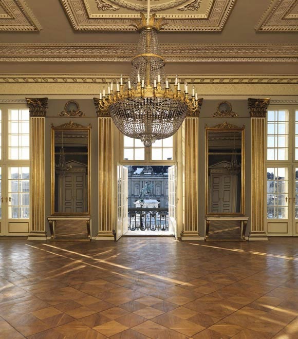
I am currently having fun designing a pair of pier glasses for the ballroom. A pier glass is a mirror which is hung or affixed to a pier –
the wall space between two windows or two doors (called a pier as it supports the ceiling above).

Above: An example of piers between two French doors very similar to our own.
Pier glasses are usually long and tall, fitted to the space, and are often framed or decorated to match the windows on either
side...

It was a common decorating idea in 18th century houses. This
was because they were used to reflect candle light (thus often there were matching tables or
consoles on the pier below the mirror for candelabras). Thus, beautiful and functional.

- Slight aside, do you know that modern diamonds are cut differently from 18th century ones as 18th century ones were made to sparkle in natural light and candle light, whereas modern diamonds are cut to better sparkle in artificial light?
Above: Examples of pier glasses in the reconstructed music room of Norfolk House at the V&A.
Below: Pier glasses in a ballroom (? In Spain).
Designers in the 18th century would design the pier glasses to match the room along with the furniture...
We have chosen to design pier glasses with arched or curved tops, as the repetition of the curves along the top of the ballroom feels less stilted than having rectangular mirrors...
Above: Curved top pier glasses.
Below: Rectangular pier glasses.
We are having the glasses made for us to fit the pier between the doors. We will then have the glasses affixed to the wall and affix gilded crystal sconces on either side.
I found many examples of framing and ornamentation for the mirrors ranging from the insanely ornate baroque to the more modest Edwardian. After some comparison I decided to base my design on this mirror, which although not Georgian would pass for 18th century...
The closest runner-ups were these two...
I am going to adapt the shield design at the centre top to a shell in order to tie the design to the consoles which will go below.
Here were some other mirrors which we compared in choosing the prototype:
More ornate French baroque styled pier glasses...
Victorian / Napoleon III Styled pier glasses...
and more modern pier glasses...
Bringing the whole sparkling look together...
Above: A Chippendale designs for a pier glass.
Below: His designs for matching consoles.
We designed the space in the ballroom specifically to accommodate two pier
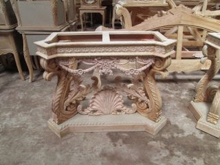
glasses and consoles, so right from conception the architectural skeleton of the room was correct. We had these consoles made as copies from a photo I took in a
antique shop. Our carvers have done a pretty good job of it…

Above: The original Georgian consoles in the Antique shop.
Below: The replicas that our carpenters have made.
Above: Interim photos for approval during the carving process.
Below: The finished gilded pieces.
Above and below you can see the shell motif in the ornamentation, which we shall use on the mirrors to tie the furniture together.
The end effect will be something like this:
Below: Other such consoles...
Sparkle came not just from the candelabras on the consoles and the chandeliers, but from additional candelabras which sat on stands known as torcheres or torchieres....
Above: Chippendale designs for torchieres.
Below: A lovely pair that came up for auction recently (not Chippendale).
more fantastic stands, this one converted for electric lights...
So this Valentine's weekend sit down and relax in the most comfortable chair in your favourite room. Dim the lights and rid yourself of any harsh fluorescent ugliness. Light a candle in front of a mirror, share a glass of bubbles with someone special and revel in your own effervescent sparkly life.
Subscribe to:
Comments (Atom)


.jpg)


