Thursday, March 26, 2015

Which White 2.. Beyond Cream!


In choosing the interior colours we finally settled on Alabaster for the ceilings (instead of double alabaster, which was too creamy), with 1/8th Thorndon Cream for the cornicing (crown molding), skirting boards, and the window and door architraves. We decided on the lighter ceiling to increase the apparent height of the rooms, and the slightly darker, off-white shade for all the trim as we felt is lent it a certain solidity (if you look at the cornicing in the photos above and below you will see that the sightly darker shade for the trim makes it look less like plaster and more like stone or wood: more solid and in keeping with a traditional home.


Also, much like the photo above, we have chosen a wall colour called Chamois (I'm sure pronounced Shammee, but tongue-in-cheek we are pronouncing Sham-Woir). It is a darker off-white derived from a lighter shade of the exterior colour (a Resene custom colour - Willowbrook), so that for consistency the walls in the common areas will have sandstone tones.


This post is all about the colour cream. People have declared that beige and cream are over. They use beige as a term to describe things that are bland and boring. But I don't think that in-offensive and boring are the same thing. I find shades of cream and beige peaceful, gentle, elegant, as well as being simply inoffensive. And let's face it, in-offensive is good for public spaces. People may not share One's impeccable sense of drama that comes from blood-red or emerald green walls. Cream does not date. It is timeless...

Above and Below: More Off-white ceilings with cream trim and beige walls.

Another popular colour, not entertained for WBP, is "Tea" which has a more magnolia/gray/purple shade to it than beige...

The shade concept however still applies: Ceiling lightest, trim darker and walls darkest. 

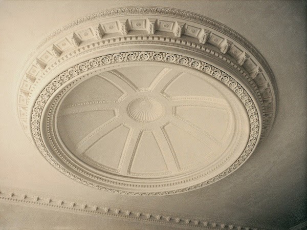
The colour in these photos most closely resembles 1/8th Thorndon cream and Chamois. I believe they are both shots of the same house. I really like the solidity of the cream architraves. The cornicing is darker than I would choose, but it does prove the point that darker tones look more substantial.

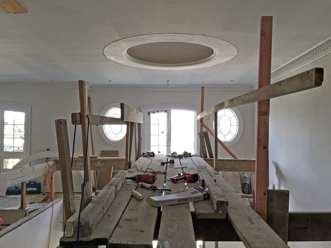
We will also pick out the plaster medallions and tracery on the ceiling in the 1/8th Thorndon cream, to provide slight contrast to the alabaster, perhaps a little more subtly than the example below...

More examples of neutral tones, creams and beiges...
All pictures found on Pinterest
(Search term "crown molding colours")

Monday, March 23, 2015

A Grand Entrance 3 - Paint's on, Gates on, Anybody Home?


The gates have finally been hung. They were a long time in the making but we are pleased with the finished product. The leaves have been gilded after the wrought iron was powder coated, so everything should be well weather proofed.

Probably the last photos we shared of the entrance were almost a year ago, when it looked something like this...

It had only just been rendered, and not painted (as we had not chosen a colour at that stage)...

Below: The finished paint colour, compared to the exterior render for the manor house (plaster tile) and the stone dentils..

But now the walls are almost finished (we just need to have the brass plaques mounted, the carriage lights hung, the lions fixed atop the gate pillars, and the security cameras installed).

Above: One of the two stone lions for atop the gate pillars.

Below: The original design for the gates, showing lights and lions.
Above: The left hand side of the entrance.

Below: Looking back down the drive towards the entrance from the inside.

Below: The right hand half of the entrance before the gates were hung or the pedestrian gate gilded.

Below: The team from Iron Design, Tauranga, who manufactured the gates and hung them.

Some of the interim photos as they were being forged...
 Above and Below: The main scroll for the top, with and without leaves.
 Above and Below: The individually made leaves.

The gate before the leaves were gilded:

The closed gates from the inside...

Views from the outside...  

You may notice in the last shot we are missing 10 buxus plants from the sides of the entrance. Some thief with OCD decided to steal the plants symmetrically from either end during the night! Please leave our hedge alone, so that everyone who drives by can enjoy it. 

Friday, March 20, 2015

Round Like A Circle In A Spiral...


The dome for The Foyer, (which Peter wants to call 'The Great Hall', as he thinks 'Foyer' sounds too French) has arrived from Perth and has been installed by the builders. It is 2.5 metres in diametre measured from the outer cornice, and 1.8m at the dome aperture, which is required as that is the same diametre as the chandelier.


There is LED strip lighting going around the lip of the inside cornicing which can be lit separately to the chandelier, which may prove useful as a night light for guests, or for more subdued lighting if one does not want 64 bulbs glowing all the time.


At one time we did toy with the idea of having the dome glassed and open to the sky above, but that would have required a dramatic reconfiguration of the roof design...

I was very keen to have a coffered dome like the pantheon ceiling...

But alas could not find one the right size pret a porter, and the builders estimated it would take about three of them seven days to make one, which was not in the budget, so we had to stick to a more elegant design (the word 'simple' is banned in our household).

Painted domes are OK if you can commission a Michaelangelo or Antonio Verrio to paint them for you, otherwise you risk them looking iffy. These designs are quite well executed...
Hotel George V, Paris.

Capital Building, Washington DC.

Castle Howard, Yorkshire.

Unknown

Unknown

Unknown

The dome is centered over a circular design in the marble floor, similar to these examples...

Below: The foyer marble plan...

The statue of the Rape of the Sabines, unfortunately, has been put on hold. So, until then, we are thinking of putting a lovely urn on a plinth in the inner curvature of the staircase, which is a very Georgian idea. Below are two photos of the hall at Osterley Park, with urns inside...

We could use this urn:

Related Posts Plugin for WordPress, Blogger...